Blog

  • Alpona117

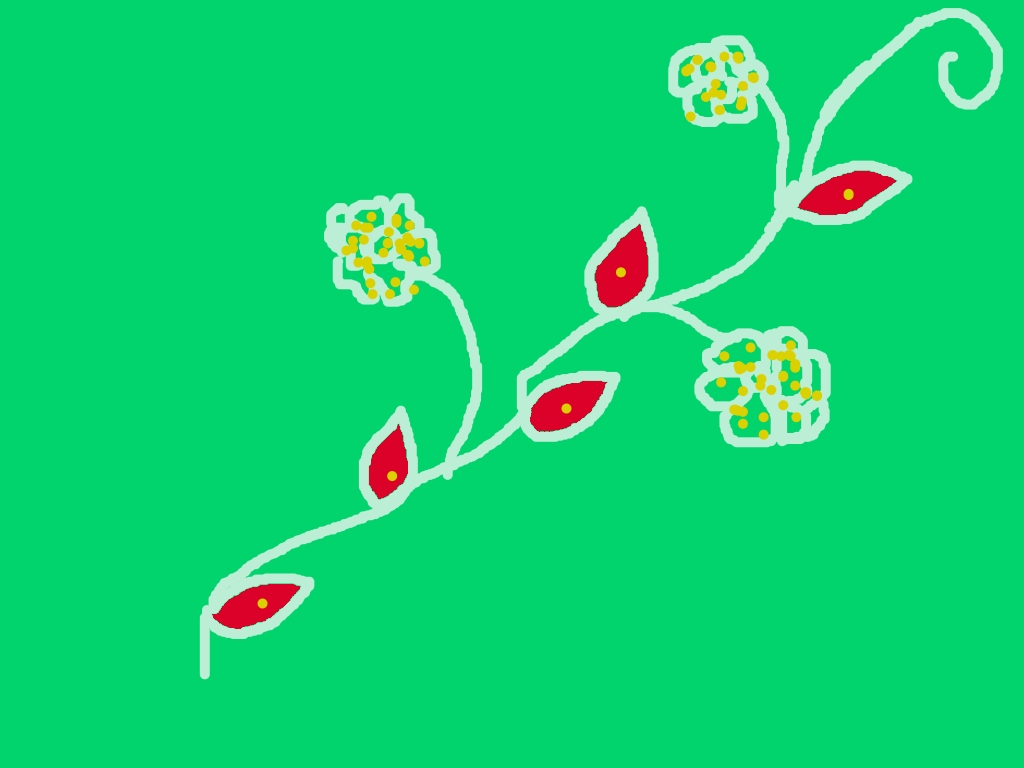
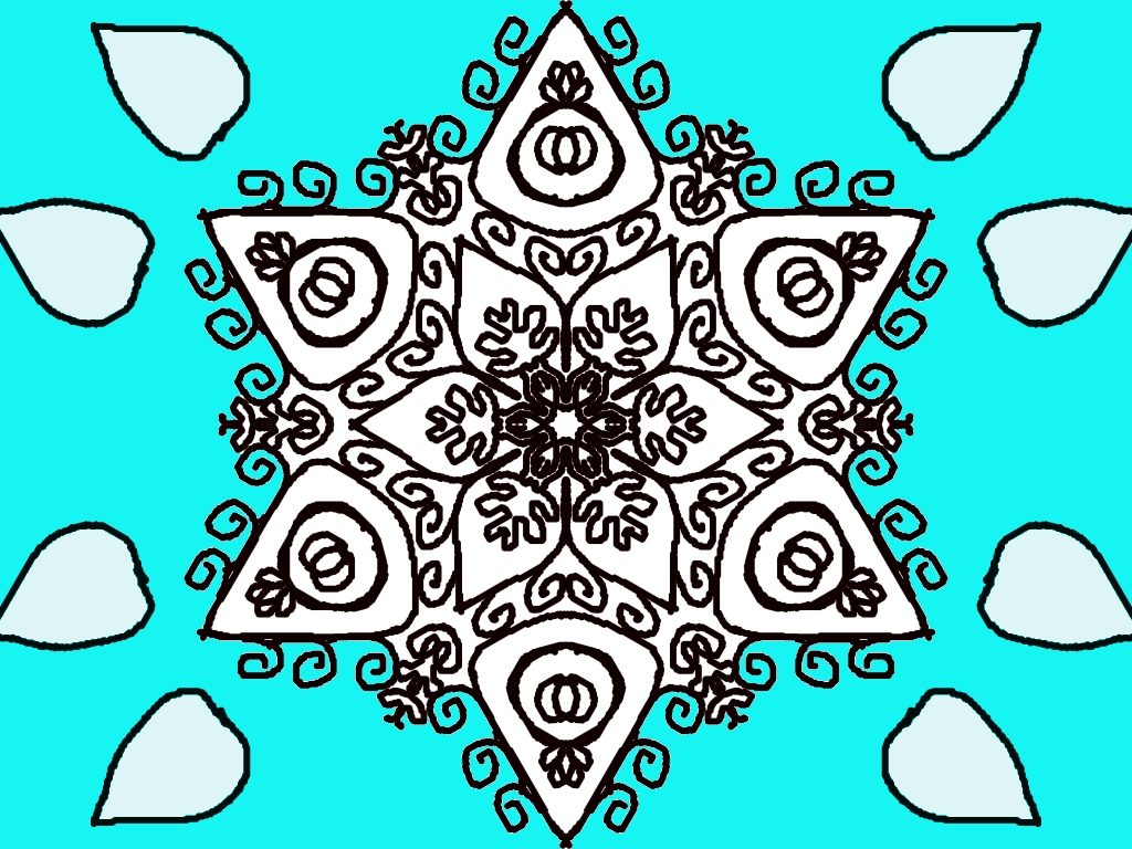
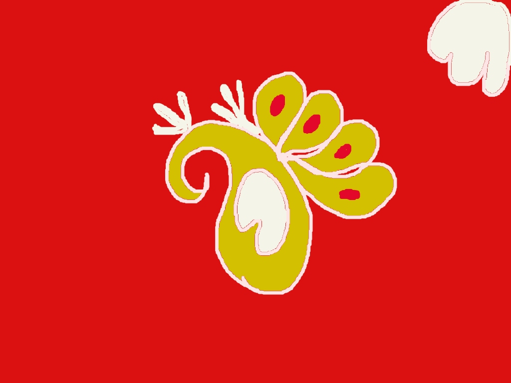
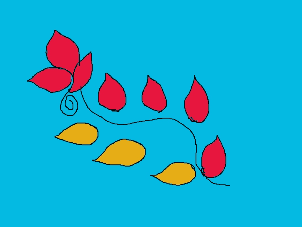
    This is a very nice rangoli-style digital design! 🌸✨ I like how you used simple shapes to create a flowing pattern.

    Here’s some helpful feedback to improve it even more:

    🌟 What’s good

    • Color combination: The red and yellow on blue looks bright and eye-catching.
    • Flowing design: The curved line connecting the elements gives a nice movement.
    • Leaf/petal shapes: Simple and clear—very good for rangoli style.

    🎨 How you can improve

    • Outline smoothness: Try making the black outlines a bit smoother and more even—it will look more polished.
    • Symmetry balance: The top part is slightly heavier than the bottom. You can add 1–2 more elements below to balance it.
    • Details inside shapes: Add small patterns (dots, lines, or veins) inside the leaves/petals for richness.
    • Gradient or shading: Try adding light and dark tones in the red and yellow areas to make it look more 3D.

    💡 Creative idea for next version

    You can turn this into a flower vine rangoli by:

    • Adding small flowers along the curve 🌼
    • Adding tiny dots around the design (traditional rangoli style)
    • Making the curve thicker and more decorative

    If you want, I can help you redraw this design step-by-step in a more advanced version 😊

  • Alpona116

    This is a really beautiful rangoli design! 🌸 Let me give you some helpful feedback and ideas to improve it even more:

    ✨ What looks great:

    • Perfect symmetry: Your circular balance is very neat and pleasing to the eye.
    • Unique shapes: The outer spiral patterns and the petal-like forms give it a creative touch.
    • Clean outline work: The dark borders stand out nicely against the background.
    • Center design: The middle floral pattern is detailed and eye-catching.

    🎨 Suggestions to improve:

    • Add colors inside shapes: Right now the white areas feel a bit empty. You can fill them with:
      • Soft gradients (light pink, yellow, blue)
      • Or alternate colors for each petal for contrast
    • Enhance the spirals: Try adding small dots or color shading inside the spirals to make them more lively.
    • Background variation: The green background is nice, but you could:
      • Add tiny dots or stars around the edges
      • Or create a slight gradient effect
    • Center highlight: Add brighter colors or a glow effect in the center to make it pop even more.

    🌟 Creative idea:

    Since you like nature themes, this design could become a flower mandala 🌼 by adding:

    • Small leaves between the shapes
    • Butterfly or petal textures

    Overall, your design is very well-structured and creative—just needs a bit more color detailing to make it stunning!

    If you want, I can suggest a color combination for this exact design 🎨

  • Alpona115

    Your rangoli design looks really beautiful and creative! 🌼✨
    I can see a strong circular symmetry, which makes it very pleasing to the eye. The repeated petal-like shapes give it a floral and slightly peacock-feather vibe—very unique!

    Here are some helpful suggestions to make it even better:

    🌟 What’s great:

    • The symmetry is excellent—everything is evenly spaced.
    • The center design is detailed and attractive.
    • The turquoise background makes the design pop nicely.
    • The outer shapes create a nice rhythm and movement.

    🎨 Tips to improve:

    • Try adding more colors inside the petals (maybe light pink, yellow, or orange gradients) to make it more vibrant.
    • The black outlines are strong—maybe make some inner lines thinner for a softer look.
    • You can add dots or small patterns between the outer shapes to fill empty spaces.
    • Add a slight shading effect inside the shapes to give it depth.

    💡 Creative idea for your next version:
    You could turn those outer shapes into butterflies or flower buds and add small glowing dots around—this will match your nature-themed style beautifully!

    Overall, this is a very neat and eye-catching rangoli 👏
    Would you like me to suggest a color palette for this design?

  • Alpona114

    Your flower design looks really সুন্দর and lively! 🌸✨ I like how clean and bright your colors are—especially the contrast between the pink petals and green leaves on the blue background. It feels fresh and eye-catching.

    Here are some simple tips to make it even better:

    🌼 What you did well:

    • Nice bold outline—very clear and neat
    • Good color combination (pink, green, yellow works beautifully)
    • The small buds and branches add extra detail 👍

    🎨 How to improve:

    • Petal shading: Add a slightly darker pink near the center and lighter at the edges to give depth
    • Leaf veins: You already added some—try making them a bit more even and slightly curved for a natural look
    • Center texture: The yellow center is nice—add tiny dots or darker spots to make it more detailed
    • Balance: You can add a few more small buds on the opposite side so it looks more symmetrical

    ✨ Extra idea (for your next rangoli):
    Try adding a soft glow or outline around the flower—it will make it stand out even more on the background.

    Overall, this is a very सुंदर and clean design—perfect for rangoli style 🌿💖
    If you want, I can help you turn this into a full rangoli pattern or add butterflies like your cherry blossom plan!

  • Alpona113

    This rangoli looks fresh, simple, and very nature-inspired 🌿😊—nice work!

    🌸 What’s Lovely

    • The curved vine design is very graceful and natural.
    • The green background gives a lively garden feeling 🌱
    • Red leaves with yellow dots stand out beautifully—good color contrast!
    • The small clustered flowers look cute and delicate.

    ✨ Suggestions to Improve

    • Smooth the outlines: Try making the white vine lines a bit cleaner and more even for a polished look.
    • Add shading: You can add a darker shade of red or green on one side of the leaves to give a 3D effect.
    • Flower detail: Maybe outline each small flower slightly or add tiny white highlights to make them pop more.
    • Balance the design: The top-right side feels slightly heavier—adding one more small leaf or flower on the left could balance it.

    🌼 Creative Idea

    You can turn this into a full border rangoli by repeating this vine pattern along all four sides—perfect for festivals or special days ✨

    Overall, this is a very pretty and calm design—you’re getting really good at nature-themed rangoli! 🌿

  • Alpona112

    This is a really beautiful rangoli design! 🌸✨ You’ve created a strong, balanced pattern that looks very eye-catching. Here’s some detailed feedback to help you improve even more:

    🌟 What’s great:

    • Symmetry is excellent – The 6-sided floral/star shape is very well balanced.
    • Creative patterns – The swirls and small leaf-like designs add a lot of elegance.
    • Center design – The middle floral pattern looks detailed and gives a strong focal point.
    • Color contrast – The turquoise background makes the white design stand out nicely.

    ✏️ Suggestions to improve:

    • Line smoothness – Try making the outer lines a bit smoother and more even for a cleaner look.
    • Petal shapes (outer ones) – The shapes around the border could be more uniform in size and spacing.
    • Thickness consistency – Some lines are thicker than others; keeping them consistent will make it look more polished.
    • Add color inside – You can fill the inner shapes (like petals or triangles) with soft colors (pink, yellow, orange) to make it more vibrant.
    • Shading idea – Light shading inside petals or swirls can give a 3D effect.

    🎨 Creative idea for next version:

    You could turn this into a flower mandala theme by:

    • Coloring each section differently (rainbow style 🌈)
    • Adding tiny dots around the edges
    • Giving the outer petals gradient colors

    Overall, this is a very strong design—just a few small refinements and it will look even more professional! 👍
    If you want, I can suggest a color scheme for this exact design 🎨

  • Alpona111

    Nice drawing! You’ve captured the essence of Mamata Banerjee with a simple and clear style 👍

    Here are some helpful suggestions to improve it further:

    What’s good:

    • The facial features (eyes, nose, lips) are expressive 👀
    • The hairstyle (bun) is recognizable and well-placed
    • The pose with the saree drape gives it character

    How you can improve:

    • Face shape: Try smoothing the jawline and making both sides more symmetrical
    • Eyes alignment: The eyes are slightly uneven—drawing a light guideline first can help
    • Neck & shoulders: The neck looks a bit tilted; you can center it more under the face
    • Saree folds: Add a few clean curved lines to show natural folds—it will look more realistic
    • Outline control: Try using smoother, continuous lines instead of shaky strokes

    Extra idea 💡 (for your rangoli style):
    You could turn this into a colorful rangoli by:

    • Using white for the saree with a blue border
    • Adding a simple background like lotus or alpona patterns
    • Keeping the face soft pastel (light peach or beige)

    If you want, I can redraw a cleaner version step-by-step so you can copy it easily 😊

  • Alpona110

    This is a really सुंदर (beautiful) rangoli-style design! 🌼 Let me give you some clear feedback and ideas to make it even better:

    ✨ What looks great:

    • Color contrast: The bright red background with yellow and white design stands out very strongly—very eye-catching!
    • Flowing shape: The curved paisley-like form gives it a traditional and elegant rangoli feel.
    • Simple detailing: The petal shapes and small dots are neat and balanced, which makes the design clean and easy to understand.

    🎨 Suggestions to improve:

    • Outline clarity: The white outline is nice, but you can make it a bit smoother and more even to sharpen the design.
    • Fill consistency: Some areas (especially the white inner parts) look slightly uneven—try filling them more smoothly for a polished look.
    • Add shading or gradient: You can make the yellow part more interesting by adding a slight darker shade on one side.
    • Balance the corners: The top-right white shape feels a bit separate—either connect it to the main design or add similar elements on other corners for symmetry.

    🌸 Creative idea:

    You could turn this into a full rangoli pattern by repeating this motif in a circular form—like a flower mandala!

    If you want, I can help you:

    • Turn this into a complete rangoli design
    • Add more decorative elements (flowers, dots, borders)
    • Or give you a step-by-step improved version to redraw

    Just tell me 😊

  • Alpona109

    Your flower drawing looks really সুন্দর and lively! 🌸 Here’s some helpful feedback to make it even better:

    🌟 What’s great:

    • Bright color choice: The pink petals with green stem and leaves look very fresh and eye-catching.
    • Clear structure: The flower shape is well-defined and easy to recognize.
    • Nice detailing inside: The yellow strokes and center details give it a natural feel.

    ✨ How you can improve:

    • Petal symmetry: Try making the petals a bit more even in size and spacing for a balanced look.
    • Outline smoothness: The black outline is good, but smoothing it slightly will make it look more polished.
    • Shading: Add light and dark shades of pink on petals to give depth (like darker near the center, lighter at edges).
    • Leaf texture: You can add small veins inside the leaves to make them more realistic.

    💡 Extra idea:

    You could turn this into a rangoli-style flower by adding circular patterns or dots around it!

    Overall, this is a very সুন্দর drawing—keep practicing, and your flowers will look even more realistic and artistic 🌼

  • Alpona108

    This is a very beautiful and well-balanced rangoli design! 🌸

    Here’s some detailed feedback to help you improve even more:

    🌼 What’s really good:

    • Perfect symmetry: The circular layout is very clean and evenly spaced. That’s not easy to achieve—great job!
    • Floral detailing: The mix of flowers, leaves, and small decorative shapes makes it look rich and full.
    • Strong outlines: The dark brown/black outlines are bold and clear, which gives the design a strong structure.
    • Center focus: The middle flower pattern acts as a nice focal point and holds the whole design together.

    ✨ Suggestions to improve:

    • Add colors: Right now it’s only outlines. Try filling:
      • Flowers → pink, yellow, or orange
      • Leaves → different shades of green
      • Center → bright contrasting color like red or blue
    • Background variation: The blue background is nice, but you could try:
      • Gradient effect
      • Light patterns (dots or soft glow)
    • Line variation: Some lines are equally thick. You can make:
      • Outer petals slightly thinner
      • Center details slightly thicker
        This will add depth.
    • Highlighting: Add tiny white dots or highlights on petals for a more festive look.

    🌟 Extra creative idea:

    Since you love nature-themed rangoli, you could turn this into a butterfly-flower fusion design by adding small butterflies between the outer leaves 🦋

    Overall, this is a very strong design—clean, traditional, and elegant. With colors, it will look amazing!

    If you want, I can suggest a color scheme for this exact design 🎨